
Visualizing scientific findings has been possible for a long time, especially at UNC, where in the 1970s Fred Brooks pioneered digital protein imaging as founder of Carolina’s computer science department. Before this, scientists hung clumsy copper-plated protein models from their ceilings.
Today researchers use visualization techniques for all kinds of things. To a biologist, visualization might mean creating a 3-D image from a fuzzy two-dimensional photo of lung cells. To a geographer, visualization might mean overlaying colorful field measurements onto satellite images. To other scientists, visualizations are simulations of real events and data that give clues about what happens inside the tiniest of molecules or what might happen to the largest of landmasses.
Sometimes, creating a visualization of scientific data is the only way to understand the data. Sometimes, it makes understanding easier. Sometimes, making a visualization is nearly impossible but also the best way to challenge what scientists think they know. And almost always, making a visualization requires that people from different fields — people who may never have needed to speak to each other — team up to help patients, inspire peers, and answer tough questions.
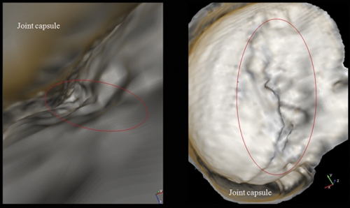
Radiologist John Clarke was studying his brand-new pictures of a patient’s shoulder joint when he saw Alex Creighton, a UNC surgeon, hurrying down the hall. He showed Creighton the images. Surprised, Creighton admitted he might consider different surgical approaches to certain injuries if he had access to Clarke’s kinds of images.
Creighton continued on his way and Clarke went back to his office, even more convinced that he had found a new and better way to diagnose joint injuries.
Years ago, Clarke was checking out his department’s new CT scanner, which allows doctors to create a virtual colonoscopy — a digital rendering of a patient’s colon as if the viewer is flying through a cavern. Clarke, who had been an orthopaedic surgeon, thought that creating 3-D virtual images of patients’ joints ought to be possible. He checked the literature; others had figured that out. But such visualization, called standard volume rendering, didn’t seem much different from arthroscopic surgery — when doctors insert a pencil-thin camera inside a joint and move it between bone, ligaments, and cartilage to find and repair injuries.
Standard rendering programs use MRIs and CTs to re-create the joint so that a virtual camera can “fly” between bone and cartilage to let the surgeon look up, down, sideways, and even backwards. What doctors see is real in the sense that real data were used to create the visualization, but Clarke says the technique is still limiting because everything is viewed up close and there’s a lot of bone and ligament in the way.
“It’s kind of like putting the palm of your hand to your face,” Clarke says. “You can look wherever you want and you can see things up close. But you can’t back away and take a look at the entire hand.”
Clarke thought it should be pretty simple to write computer code that “cut away” whatever tissue he didn’t want to see so he could view injuries from better angles. In the case of the shoulder, he wanted to see the entire shoulder socket, which means that the ball of the humerus would have to be rendered invisible.
Stephen Aylward, Clarke’s colleague at the time, told Clarke about Russell Taylor, a computer scientist who needed interesting projects for his visualization course. Taylor liked Clarke’s idea and gave the project to three students who wrote a program to read CT data files of past patients. But because of time constraints, the students couldn’t create the kinds of visualizations Clarke needed.
Then David Borland, one of Taylor’s graduate students, came into the picture. He wrote his dissertation on what’s now known as flexible occlusion rendering. He used CT scans and MRIs to write an algorithm that assigns numerical values to different shoulder parts, such as bone and cartilage. Then he wrote a program to make the numerical values assigned to certain shoulder parts invisible from certain viewpoints. This allowed Clarke to see whatever he wanted from any angle.
“It’s easy to render all bone and cartilage invisible or visible,” Borland says. “The tricky part is when you have multiple objects of the same material occluding each other.”
“The result is we can pull back and look at whatever we want,” Clark says. “I can turn around and look at the ball of the humerus without having the constraint of being so close or being within the joint.”
Clarke, Borland, and Taylor have two patents pending on their technique, which they licensed nonexclusively to Siemens, a global engineering firm. Clarke says that flexible occlusion rendering will allow doctors to make better and faster judgments and give more information to doctors — if they want it.
Henry Fuchs, a computer scientist who has been exploring visualization methods for three decades, says he’s spoken to doctors who think traditional images are closer to the truth than virtual visualizations. “But that might not be so,” Fuchs says.
Take x-rays, for instance.
“It’s impossible to tease from that x-ray the three-dimensional nature of what’s happening,” Fuchs says. On the other hand, he says, computer scientists shouldn’t say that their visualizations are perfect. A visualization can sometimes lead researchers to be certain about things that should be left to the imagination.
“Where exactly is that boundary between cartilage and bone?” Fuchs says. “In an eighty-six-year-old patient whose bone density is getting lower and lower, what we say is bone in a visualization might not be bone.”
This gray area is one reason why Taylor thinks of computer scientists as toolsmiths who work with scientists to solve problems. In the case of flexible occlusion rendering, Clarke can compare his new visualizations to the original shoulder images. The new method adds to knowledge; it doesn’t replace knowledge.
Borland’s technique doesn’t tread too far into the unknown; nor is it very complex, its inventors admit. There are far more intricate systems in the body that are more difficult to visualize. The human lung, for instance, is full of mystery. Visualizing its many microscopic movements takes a whole other level of tool-making.

Simulating cilia
When we last wrote about the Virtual Lung project (See Endeavors, Fall 2004, “Branching Out”), Ric Boucher, Greg Forest, and Rich Superfine had just started working together. Boucher, a medical doctor, was able to explain to Forest, a mathematician, and Superfine, a physicist, how a normal lung clears mucus. Boucher knew what each lung component did but not how they worked together. If Forest and Superfine could help figure that out, then Taylor and others could create virtual models of the lung’s entire system.
Several computer programs would be dedicated to each component of the lung, says the computer scientist Taylor, who’s also involved in the project. Researchers could enter information into the programs and run simulations on how, for example, a new asthma drug might work. Then researchers could watch everything unfold in three dimensions on a huge computer screen. This would inspire new experiments and treatments.
But while the researchers were trying to figure out how the lung’s components speak to each other, they realized that they themselves weren’t speaking the same language.
“During those early meetings,” Forest says, “one of the great words we were using with very different meanings was ‘stress.’ Someone actually had to say, ‘Stress for us actually has physical units that can be measured.’”
Superfine laughs and adds, “Here’s another great word — model. For Greg, a model is a system of equations. For medical scientists, a model is a rat or a mouse.”
Forest says, “So you say a word and it triggers understanding, right? But a lot of times we’d talk and talk, and we wouldn’t understand each other.”
But they kept meeting weekly, without grant money. After about a year they all got on the same page. They got grants, attracted people to their cause, and started visualizing various parts of the lung.
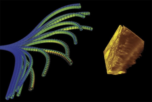
Sorin Mitran, an applied mathematician who works with Forest, created a simulation that shows how cilia beat.
Cilia stick out of lung cells and move in coordination to push mucus over a thin layer of water. When the cilia don’t work properly, mucus lingers in the lung and becomes a breeding ground for bacteria and infection. This is what happens in patients with cystic fibrosis.
Scientists have three theories for why cilia beat in unison to push fluid. Maybe a chemical signal tells them to “beat now.” Maybe cilia are part of some electrical network. Or, the simplest explanation: maybe individual cilia feel which way the fluid is moving, and try to beat with the prevailing flow conditions rather than oppose them. Mitran tested that last one.
“My goal was to build a computational model that captures as much as possible the true physics involved in cilia beating and thereby propelling fluid,” he says.
A single cilium is made up of flexible cables that are linked together by even-more-flexible springs.
“This is essentially a beam and truss structure,” Mitran says. “We can use specific models of structural mechanics to create a mathematical description of a cilium.”
Mitran wrote his equations, plugged them into three dozen CPUs, and let them evolve. About a week later, the computers kicked out a boatload of data in the form of numerical simulations. Mitran then used different computer programs to create visualizations so that colleagues could see what his equations revealed about the nature of cilia.
He found that each cilium can beat randomly but can then adjust its beating so that it doesn’t expend too much effort in pushing mucus, and when all cilia behave this way, they coordinate and push mucus more efficiently. The natural interaction between cilia and mucus helps cilia push mucus out of the lung.
Researchers had thought a signal might be responsible for cilia coordination because there was no other explanation. “My work shows that there’s no need for a signal,” Mitran says. “The point here is that, well, no, you don’t really need to think about it that way.”
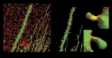
Biologist Bill Davis, a cystic fibrosis researcher, says that Mitran’s simulations have helped him understand mucus clearance, even though a simulation doesn’t show exactly what happens inside a lung.
“Sorin starts his simulation with thousands of cilia beating randomly,” Davis says, “and then you can see them starting to beat together. It’s amazing to actually see it.”
Taylor says that Mitran’s model will eventually be coupled with others to test therapies, though this is some way off.
The lung is “incredibly complicated,” Davis says. “There are thousands of proteins involved, and how they all work together is a bigger problem than any mind can understand. So ultimately, the hope is that through these models we’ll come to understand the right questions we need to answer so we can write the next iteration of models and progressively get them better and better. And our understanding of how the whole system works will then be elevated.”
“Right now,” Taylor adds, “we have bits and pieces of the entire system.”
For Mitran, his data sets are more important than the visualizations they help create. “It’s the physical theory we’re interested in verifying,” he says, “because it’s the theory that provides insight and understanding. Where visualization is important is in stimulating a researcher’s imagination to build a new theory and also in popularizing results to a wider audience.”
Also, Davis points out that simulations and models contain what Forest calls sins of approximation — assumptions that researchers have to make when writing code for models because no one really knows the exact physics of cilia and mucus or how thousands of proteins interact.
Biologists, then, typically make a distinction between simulation and visualization.
“To me, visualization is creating an image from something that exists,” Davis says. And for biologists, that’s microscopy.

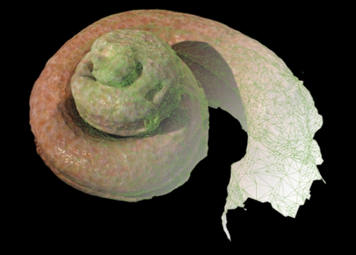
Davis and many others work with Michael Chua, director of the Michael Hooker Microscopy Facility, to create 3-D images from 2-D confocal microscope scans. The technology works like a digital camera. The electronic shutter in a microscope’s camera lets in shades of light that are given numerical values. From those numbers a color image is created. Chua extracts those numbers from the camera to make 3-D color visualizations, including images of cilia.
Neurobiologist Alain Burette worked with Chua to create 3-D images of neurons to find out where calcium pumps are positioned on a dendrite — an extension of a nerve cell by which cells communicate. Calcium is a key part of how neurons communicate with each other and how memories are stored.
“It was extremely difficult to get a sense of where things are in a two-dimensional image,” Burette says. Even in a three-dimensional image, he couldn’t find the pumps.
Chua introduced Burette to Taylor, whose grad student Dennis Jen wrote computer code that, like Clarke and Borland’s program, assigned numerical values to different parts of the neuron. This allowed Burette to remove whatever he didn’t need to see from the 3-D images so he could pinpoint the pumps.
Burette says that molecular biologists now have an extensive list of protein parts. “But now we’re entering something of a new era where we’re asking how things are actually built. It’s like a car; we need the blueprints to understand where everything is and how the parts work together.”
Burette created a website to let scientists download the visualization program ImageSurfer. His team is now upgrading the software package to allow plug-ins. “This would turn our software into a platform so that people could write a little bit of code to solve their own problems and then port their code to our software so everyone could use it.”
Thousands of researchers have downloaded ImageSurfer, and Burette hopes it will one day rival ImageJ, a popular online software package for 2-D image analysis.
Davis says, “Alain’s project is one of the best quantitative microscopy projects I’ve ever seen because it was developed to answer actual biology questions.”
Many researchers would like their fields to be as exact as microscopy, but they often have to deal with a lot of unknowns. Taylor and others say visualizations such as Mitran’s models help make sense of those unknowns. And so do models that use known data to predict how future events will unfold.

Mapping the future
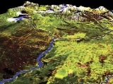
Geographer Steve Walsh uses satellite images, aerial photography, and field imagery to show how landscapes have changed and might change in the years to come, even in faraway places we think of as pristine.
In the Galapagos Islands, guava trees are swallowing up native grasslands and endangering endemic flora and fauna. Walsh says that eradication techniques work best when the guava trees are small and not clumped together. So Walsh created maps and models of the islands to show where the guava is and where it might spread. He used a handheld spectral radiometer, a plant canopy analyzer, and GPS technology to measure the amount of energy reflecting off of guava plants of different sizes, shapes, and ages. He also analyzed plant type, condition, and the density of the forest canopy. Then he superimposed this data onto satellite images to show the huge swaths of guava as red splotches on the landscape. Using data from several trips, Walsh’s team created models to show how guava will spread if left alone and how guava will react to specific eradication methods. And he gave his findings to conservationists on the islands.
Walsh used similar techniques in the Amazon. After oil companies built roads to explore the forest, Ecuadorians used the roads to penetrate the Amazon and start farming. Walsh modeled this evolution; the change from forest to farms and barren fields is stunning.
“There is almost no forest left in this one area,” Walsh says. “And it didn’t really take that long for this to happen.”
Sometimes it takes Walsh’s team weeks or months to make models — not a big concern for geographers. But other researchers don’t have that kind of time.
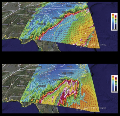
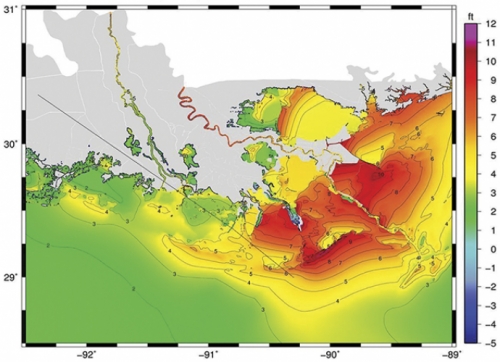
Marine scientist Rick Luettich has been making models of hurricane storm surges for a decade, and his simulations used to take two weeks to process because he lacked proper computer power. Now he has it.
In March 2006, UNC finished building the Topsail computing cluster, one of the twenty largest computer clusters in the world, to help people such as Luettich. Last summer his team created accurate models of the storm surges that came with hurricanes Gustav on the Gulf Coast and Hanna in North Carolina, thereby helping state and federal agencies warn people in harm’s way what to expect. A few days after Gustav, the New Orleans Times-Picayune used Luettich’s model results to create a front-page visual that showed readers why the storm surge did not cause too much damage, which is what Luettich forecast.
To make the model, Luettich’s team created a digital grid of many triangles and placed it on a map of the coastline. Within each triangle, computer code adds information such as wind, ocean depth, ocean current, and storm statistics to calculate what a hurricane will do to the water level. Within each triangle, all the information is the same. So the smaller the triangles, the more accurate the model.
This same sort of technique can be used in other large-scale situations, but modeling some landscapes — such as cities — and predicting something that changes every second — such as wind — can get a little complicated.

The Manhattan project
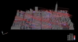
In January 2007 environmental scientist Alan Huber jumped to his feet while watching news reports of a foul stench that Manhattan police and firefighters could not identify. The city shut down its rail line to Hoboken, New Jersey. Police evacuated buildings. New Yorkers immediately assumed terrorism. But Manhattan’s health department, the Coast Guard, and Con Ed Energy determined that the odor was natural gas. And it dissipated later that day. Had Huber been there, he would’ve offered his services; he had been creating models of what might happen if a toxin were released in Manhattan.
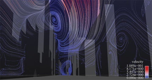
For ten years Huber had been making more and more detailed simulations as a scientist at the Environmental Protection Agency (EPA). But over time his simulations demanded more computing power than the agency could provide. As an adjunct professor at UNC, Huber was able to produce simulations of wind flow in Manhattan that were impossible to make at the EPA. He now uses more than 256 of Topsail’s 4,016 computer processors, and he’s working with the Renaissance Computing Institute (RENCI) in Chapel Hill to create visualizations.
First, Huber’s team created a digital model of midtown Manhattan’s seven thousand buildings. The team used commercially available geometry that had been created after telecommunications companies took aerial photos of New York to figure out where to put cell phone towers.
Next, Huber applied fluid dynamics numerical methods to the model to solve for the winds, pollutants, and particles that flow through midtown. The entire model is divided into fifty-four million cells; think of a mosquito net tossed over Manhattan. Dividing the model into geometric cells — as Leuttich did with his triangles — allows Huber to calculate detailed wind flows on city streets and up the sides of buildings.
When Huber adds a change of wind direction into an experiment, he can produce different visualizations of what the city would look like if a pollutant were released and carried by wind.
Without the visualization, Huber says, the most he could do with his data would be to pull out a few numbers and plot them on a graph. Maybe those numbers would say something about the air quality of a few isolated places in Manhattan. His visualization, though, actually presents all of the data at one time.
“There are some people who would say, ‘That’s a picture,’” Huber says. “I have to be careful to assure them that I have the physics set up and without the picture, I’d have nothing. I couldn’t even understand what’s going on without the visualization. The danger, though, is that someone could use inaccurate information to make a visualization that looks realistic.”
Last year Huber started working with David Borland at RENCI to create more detailed visualizations that Huber wants to view in RENCI’s special viewing rooms. Ideally, Huber would start the simulation and then change some of the model parameters so he could interact with his data as the simulation evolves.
“But I haven’t even told the guys at RENCI about this yet,” Huber said.
So I did. Borland told me that Huber’s idea is entirely possible.
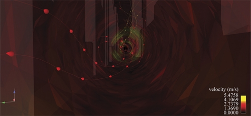
Borland has created several visualizations that, if viewed in RENCI’s dome room, make you feel as if you’re standing on Broadway’s yellow line and seeing the wind, symbolized by streamlines of different colors, whirl past you.
“If you’ve spent some time in a city, you know the wind will be in your face and then a half a block down it’ll be at your back due to the influence of buildings,” says Huber. “We want to create that real experience as much as possible.”
Retuning the ear
The dome room is like a small, close-up planetarium. It lets visitors become immersed in whatever’s being displayed. Researchers like this room because it takes their abstruse data and makes them real. For some, this process inspires more questions and pushes their work forward.
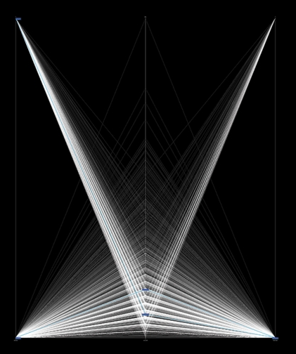
This is what Charles Finley hoped would happen when he began working with RENCI. During a 2008 seminar, Finley used the dome room to present visualizations of cochlear implants — devices that help the deaf to hear. He worked with Borland and Eric Knisley to create several visualizations, including one that shows what it would be like to fly through a cochlea. It’s an incredible teaching tool but not as important to patients as RENCI’s other visualizations, one of which shows how electrical currents communicate sound from the cochlea to the implanted device behind the ear. The way electrical pulses travel along these pathways could affect how much a cochlear implant helps a patient hear.
A cochlear implant works by using electrodes placed deep inside the ear to stimulate nerves inside the cochlea. These electrical signals then flow to another electrode implanted under the scalp behind the external ear and, with help from a speech processor, allow a deaf person to hear.
“For some patients, the implant works really well,” Finley says. “But a lot of patients say they would be able to hear what I’m saying if I could make the noise go away.”
The noise sounds like an echo, or like the patient is standing at the end of a long hallway. Some patients say the noise sounds like a detuned radio.
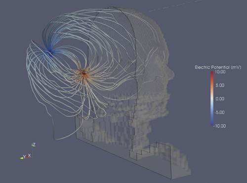
Finley couldn’t figure out what might be causing the problem until he had graduate student Punita Christopher measure electrical field patterns around patients’ heads.
“Her data were unexpected,” he says. “When we stimulated a particular part of the cochlea, all the current flowed along the same pathway as it left the inner ear. We couldn’t tell which electrode inside the cochlea was being stimulated.”
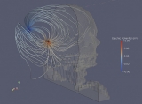
Finley’s hypothesis is that the electrical currents may be stimulating two different areas along a course of nerves, causing interference or noise. He worked with Mark Reed, a research scientist at RENCI, to model a cochlear implant inside a patient. Then they gave their data to Borland, who created visualizations that show exactly where the currents are flowing.
“Because of these visualizations we’re getting a good appreciation for the actual pathway where the current flows,” Finley says. “We think it flows out through some little channels in the cochlea where the nerves are and it’s forced that way because of the bony structure of the ear.
“We’re now developing new experiments with patients to see if we can manipulate this type of stimulation. And we’ll see if the echoes or noises go away.”
Finley had his eye on RENCI ever since it formed in 2004. RENCI’s first director, Dan Reed, was still working out of boxes when Finley knocked on his door to talk about collaborating. Reed left RENCI in December of 2007, but interim director Alan Blatecky says visualization is a key tool now more than ever. “You’ve heard the term ‘data tsunami,’ right?” Blatecky says. “We’re getting this incredible growth of data in science and business. And we need to figure out how to get useful information out of all those data. The only way to do that well is through some sort of visualization. If you give people a stack of 150 pages of numbers, nothing happens. But if you have a good visualization of those numbers, then people say, ‘Hey, look at this trend,’ or, ‘I hadn’t noticed this,’ or, ‘What if you tweak the data this way?’”
In autumn 2006, RENCI started a fellowship program to attract UNC faculty who were interested in working with its computer scientists on visualization projects. Finley jumped at the chance, won a fellowship along with three others, and started working with Borland, Knisley, and Mark Reed.
Carolina researchers, though, don’t have to win a fellowship to work with RENCI. And they don’t have to be scientists, either.
A bigger picture
When Julia Cardona Mack in Romance Languages saw Finley’s presentation at RENCI and “flew” through a virtual cochlea, she thought, “Wow, wouldn’t it be great to use this technology to explore a really big space?”
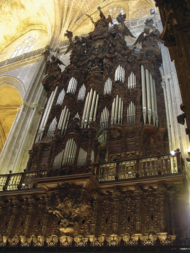
Cardona Mack knew just the right building: the Cathedral of Seville.
“Imagining what this structure looks like is really hard because the naked eye can’t capture all of it,” she says. “It’s dark inside, and it’s just so huge. It takes up a whole city block.”
The cathedral is the largest Gothic cathedral on the planet, a United Nations World Heritage Site, and a classic example of what happens to very old buildings when one culture subsumes another. For three hundred years, the building was a mosque. Then Christians reclaimed Spain, and in 1401 the locals decided to transform the building into a Roman Catholic cathedral, and built on top of the original structure.
Cardona Mack, who has been to the cathedral several times, can point out where the mosque ends and the cathedral begins. Muslim builders used mostly brick and tile; Christians added marble, gold, and alabaster. In pictures, Cardona Mack can see some of the many different construction styles used over the course of eight centuries. From the floor of the cathedral, she can see paintings and stained glass windows sixty feet above, but not the wood carvings on their frames. She can’t see the intricate details on sculptures, paintings, or the dome ceiling; nor can she fully appreciate the gold and ironwork on the choir grill. And some of the decorative structures, such as windows and engravings, are in disrepair. Visualizations could show us what these artful pieces look like now and what they once looked like.
All this, she says, would be especially valuable to students in UNC’s Year in Seville study abroad program. “When students see a building during a study abroad trip, it’s going to be one of ten buildings they see that day,” she says. “If students had already flown through the building, so to speak, then they’d be primed for it when they see it in person. And because this building has seen so much history, it’s a good place to start a discussion about tolerance, coexistence, and the hybrid nature of societies at any point in time.”
Cardona Mack has been consulting with Knisley about creating a virtual cathedral. “There are a number of different techniques we could use,” he says, “but it wouldn’t be a trivial task.”
Scanning devices — some that UNC has — can capture raw visual data of the cathedral to make 3-D renderings. Think of a virtual-reality video game. The cathedral is so enormous, though, that Knisley says it would be best to scan one section of the cathedral to see if they can develop a proof of concept.
Cardona Mack has already procured a document that could help Knisley: an atlas that the Spanish National Research Council published in 2007 that contains intricate architectural details and measurements of every square inch of the cathedral.
“There are no pictures or images of what the cathedral looked like when it was a mosque,” Cardona Mack says. “With this material, we could re-create the mosque. I think that’s fascinating, and I’d think art historians and architects would be really interested in this, too.
“Of course, I also value the sheer joy of the game — traveling up the walls and up the sides of the dome, over the colored paintings, through a window to see the cathedral rooftops and the horizon,” she says. “It’s not an experience any human being is likely to have in real life. Just for that reason I think it’s valuable.”
She also points out that Seville is built on swampy land, a fact that halted construction of skyscrapers as well as a subway in the 1970s. The cathedral’s highest tower is still the tallest building in town. Cardona Mack wonders how long the cathedral will stand.
Right now her vision is only an idea. She has to put together a grant proposal and then find the time to meet with the cathedral’s gatekeepers. She also has to find other faculty who are as interested in this project as she is. Otherwise, she fears she may never get it off the ground.
“Someone once told me that things get done if someone is passionate about it,” she says. “True, but I think more things get done when people work together.”
John Clarke is an associate professor of radiology in the School of Medicine. Russell Taylor is a research professor of computer science, physics and astronomy, and applied sciences and engineering in the College of Arts and Sciences. David Borland and Eric Knisley are senior visualization researchers at RENCI. Clarke, Taylor, and Borland worked with the Office of Technology Development to patent and license flexible occlusion rendering. Henry Fuchs is the Federico Gil Professor of Computer Science. Greg Forest is the Grant Dahlstrom Distinguished Professor of Mathematics, and Sorin Mitran is an associate professor of mathematics in the College of Arts and Sciences. Rich Superfine is a professor of physics in the College of Arts and Sciences. Bill Davis is a research professor, Alain Burette is a research associate professor, and Michael Chua is an assistant professor, all in the department of cell and molecular physiology in the School of Medicine. Steve Walsh is a professor of geography in the College of Arts and Sciences, a research fellow at the Carolina Population Center, and director of UNC’s new Center for Galapagos Studies. Rick Luettich is a professor of marine sciences and director of the Institute of Marine Sciences. Alan Huber is an adjunct assistant professor with the Institute for the Environment. Charles Finley is a research associate professor of otolaryngology and biomedical engineering in the School of Medicine; he advised Punita Christopher, who received her doctorate in December 2007. Julia Cardona Mack is a senior lecturer in the Romance languages department in the College of Arts and Sciences.